Showing posts with label ArcGIS. Show all posts

Thursday, March 27, 2014

Vector Analysis 2 Module 10

Desoto National Forest Possible Camping Sites

In this weeks lab I performed buffering, dissolve, and overlay. Buffers and overlay are two of the most common operations in GIS. A buffer is a area that is x amount of distance away from a map feature. With buffers you can choose different areas to buffer based on the map feature. You can also apply multiple buffers to the same feature to create a range ring around the feature.

With the above map I was given the vector data and requires to create buffers around the lakes, roads, and rivers. These features were then overlaid with the conservation area file. The conservation areas I am not allowed to camp in, the areas of the conservation area that overlapped my buffers were then removed from the map. The buffers that I created were 500 meters of a river, 300 meters of a road, and 150 meters of a lake. Since I was only given the vector data I added a base map that allowed to see that this campsite was was in the Desoto National Forest.

Friday, March 21, 2014

Isarithmic Mapping Module 9


This week I learned about Isarithmic Maps. Isarithmic maps are also known as contour maps or isopleth maps depict smooth continuous phenomena such as precipitation or elevation. Each line-bounded area on this type of map represents a region with the same value. For example, on an elevation map, each elevation line indicates an area at the listed elevation. 

On Both maps I added contour lines to help delineate were the values changed for each step. To create the contour lines I used the spatial analysis tool.

Thursday, March 6, 2014

GIS Data Search Module 7 and 8


In this exercise, I comprehensively mapped one county in Florida. I acquired and format data, then create one or several maps to display those data. To bring all these feature into map projects, I explored both the LABINS,USGS,and FGDL web sites.  These sites contained all the data files I needed to complete this project.

Friday, February 28, 2014

Choropleth Mapping Module 7

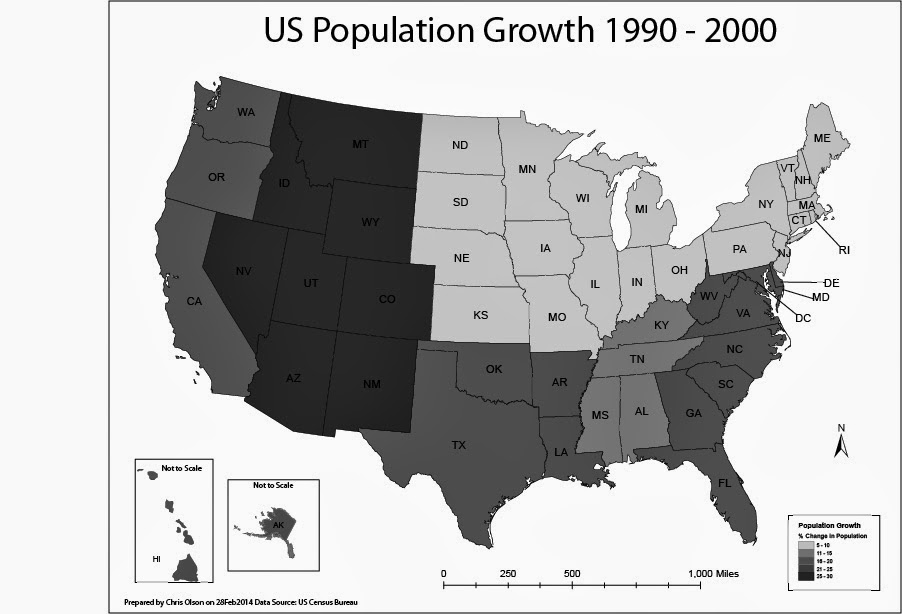
In this lab, I produced two choropleth maps showing population change in the United States of America. I used census data to illustrate the percent population change of each state for the period of April 1, 1990 to April 1, 2000. I used both ArcGIS and Adobe Illustrator to complete this assignment. 

A choropleth map is a thematic map in which enumeration units are shaded with an intensity proportional to the data values associated with those units.

The first map displayed population change percentage at the State Level. I used the Natural break method for the first map to split of the data. For this map I selected a light to dark khaki color ramp to show the change.

The second map will display population change at the level of U.S. Census Divisions.
On the second map I manually created the breaks into even divisions.


Friday, February 21, 2014

Data Classification Module 6


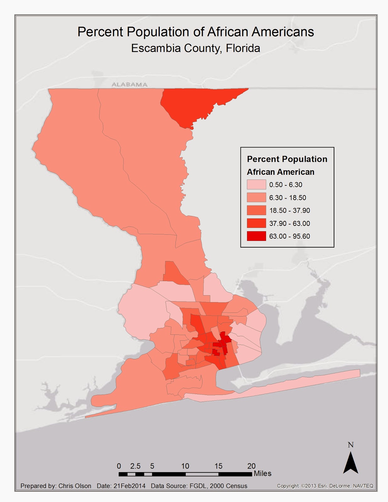
In this lab I explored the different ways that data can be displayed within ArcGIS. I displayed Equal Interval, Quantile, Standard Deviation, and Natural Break. This map displays the natural break. I choose this because it most accurately depicts the population of Escambia county. 

Thursday, February 20, 2014

Projections Part 2/Data Search Module 6


Week 6! This was a rough week, not everything went as planned in this lab. There were a few steps that I could not get due to user error or computer error. I tried all the trouble shooting that we had in the discussions post as well as with an instructor through email. Anyways this week I set out to find the information that I needed for the lab rather than the instructor spoon feed it to me. I visited LABINS and FGDL to gather data sets that were needed for the lab. After acquiring the data it had to be reprojected so that all the sets matched and projected on top of each other. This is where I ran into issues, no matter what I tried nothing seemed to work. So I moved on and used ArcGIS's on the fly projections to finish the lab and create the map above.

Thursday, February 13, 2014

Projections Part I Module 5


In this lab we loaded three different coordinate systems into ArcGIS to compare the differences between them. As you can see in the legend the square miles of each county is slightly different in each of the systems. This lab is a good example why it is important to watch which system that you are using.

Friday, January 24, 2014

Introduction to Adobe Illustrator Module 2


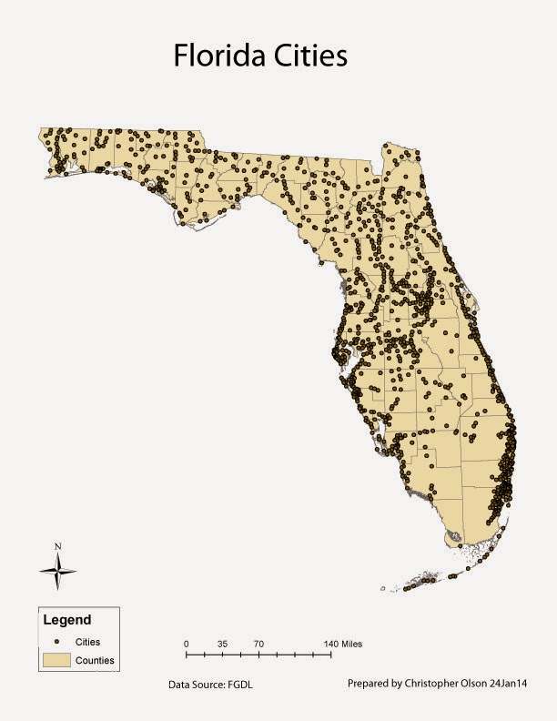
Here is a basic map I created with ArcGIS and Adobe Illustrator. This was my first experience with Illustrator. I quickly found that this program is very powerful and will take some time to learn. I would say master, but by the time that happens they will have moved to the next version. The user interface is simple to pickup as it is organized much like Arc from the brief exposure to it. This map was created from a map that was already created within Arc minus the labeling. I exported this map from Arc as a .ai and imported that file in Illustrator. Once in Illustrator I organized the different layers and groups so that the data in the file could easily be manipulated. It was important that the scale bar and the county groups were within the same layer; If they were not in the same layer the scale bar would not be adjusted to the counties when the map is resized. The final step was to add text to the map. I added the title, name, date, and data source via the text tool. Once I was happy with the map I exported it as a jpeg to be shared.

Wednesday, January 22, 2014

Own Your Map! Module 2


In this weeks lab I worked on further manipulating the map within ArcGIS. I added two data frames which allowed a inset to be displayed on the map to give a overview of the area. I also added a interstate, river, and UWF Escambia county location shape-file. The interstate and river files were trimmed to the boundaries of Escambia county to keep the map clean. The star is the Escambia county campus for UWF.

Friday, January 17, 2014

Map Critique Module 1

Bad Map Design


This is a bad map for many reasons.  The main problem is there is entirely too much information. What is being displayed here could easily be broken up into several maps. The author of this map may have interesting and good data but one cannot understand what is being portrayed without spending a good a lot of time reading each legend at carefully studying the map. The author put in the time to gather data and make the map, but what you take out is confusion of over lapping data on a very large scale.

Good Map Design


This is an example of a good map. This map shows clear and detailed ancestry information through simple colors, which are pleasing to the eye. It uses simple, neutral colors, which work well with this type of data. The contrasts of neighboring colors make smaller details stand out. The labels used are simple and clear information. This map follows all of Tufteisms from The visual Display of Quantitative information. Although this map does not have a North arrow it is assumed that North is up as the target audience will be some one from the United States. Also the map would not be used for navigation purposes, as it does not have navigable features.

Thursday, January 16, 2014

ArcGIS Overview Module 1


Here is the first map that I have created for GIS4043. The process that the class uses is different that what I used though work. The layout view is hard to work with until you have experience with it, once you know how it works it becomes easier. I started by adding the country and city data to this map. After that I manipulated the data to break the counties up by their populations. I then added the legend, scale, North arrow, and title.

Tuesday, January 7, 2014

Introduction


Hello, I started out in the military working as an Imagery Analyst where I was stationed at Offutt AFB in Omaha NE. I completed my enlistment there and moved to Huntsville Al. While in Alabama I worked for Intergraph creating 3D shape files using their software, which they said was number two on the market to ARC. No one that I have talked to has ever heard of it either. After two years in Huntsville I moved to Gulf Breeze Fl where I have worked at Hurlburt Field for the last 7 years as an Imagery Analyst. I have done some GIS work while in Florida but not as much as Alabama. I have just completed by BAS in Technology and Resource Management. I hope the GIS track is more enjoyable than getting a degree so that I could check a box off on applications.