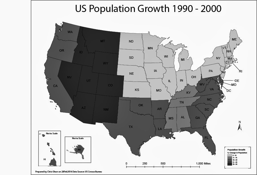
In this lab, I produced two choropleth maps showing population change in the United States of America. I used census data to illustrate the percent population change of each state for the period of April 1, 1990 to April 1, 2000. I used both ArcGIS and Adobe Illustrator to complete this assignment.
A choropleth map is a thematic map in which enumeration units are shaded with an intensity proportional to the data values associated with those units.
The first map displayed population change percentage at the State Level. I used the Natural break method for the first map to split of the data. For this map I selected a light to dark khaki color ramp to show the change.
The second map will display population change at the level of U.S. Census Divisions.
On the second map I manually created the breaks into even divisions.


No comments:
Post a Comment