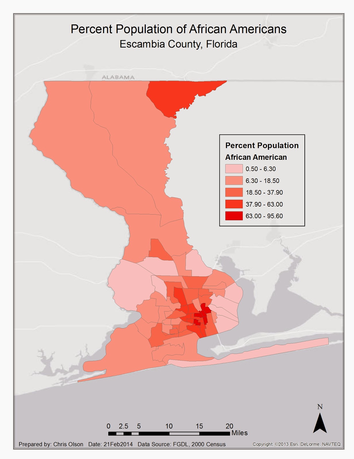
In this lab I explored the different ways that data can be displayed within ArcGIS. I displayed Equal Interval, Quantile, Standard Deviation, and Natural Break. This map displays the natural break. I choose this because it most accurately depicts the population of Escambia county.
Did you do the background with a basemap? It looks nice
ReplyDeleteI used the light grey canvas basemap for the background.
Delete