 |
| Migration into the U.S. 2007 |
Thursday, March 27, 2014
Flow Line Mapping Module 10

Vector Analysis 2 Module 10
 |
| Desoto National Forest Possible Camping Sites |
In this weeks lab I performed buffering, dissolve, and overlay. Buffers and overlay are two of the most common operations in GIS. A buffer is a area that is x amount of distance away from a map feature. With buffers you can choose different areas to buffer based on the map feature. You can also apply multiple buffers to the same feature to create a range ring around the feature.
With the above map I was given the vector data and requires to create buffers around the lakes, roads, and rivers. These features were then overlaid with the conservation area file. The conservation areas I am not allowed to camp in, the areas of the conservation area that overlapped my buffers were then removed from the map. The buffers that I created were 500 meters of a river, 300 meters of a road, and 150 meters of a lake. Since I was only given the vector data I added a base map that allowed to see that this campsite was was in the Desoto National Forest.
Friday, March 21, 2014
Isarithmic Mapping Module 9


On Both maps I added contour lines to help delineate were the values changed for each step. To create the contour lines I used the spatial analysis tool.
Thursday, March 6, 2014
GIS Data Search Module 7 and 8


In this exercise, I comprehensively mapped one county in Florida. I acquired and format data, then create one or several maps to display those data. To bring all these feature into map projects, I explored both the LABINS,USGS,and FGDL web sites. These sites contained all the data files I needed to complete this project.
Friday, February 28, 2014
Choropleth Mapping Module 7

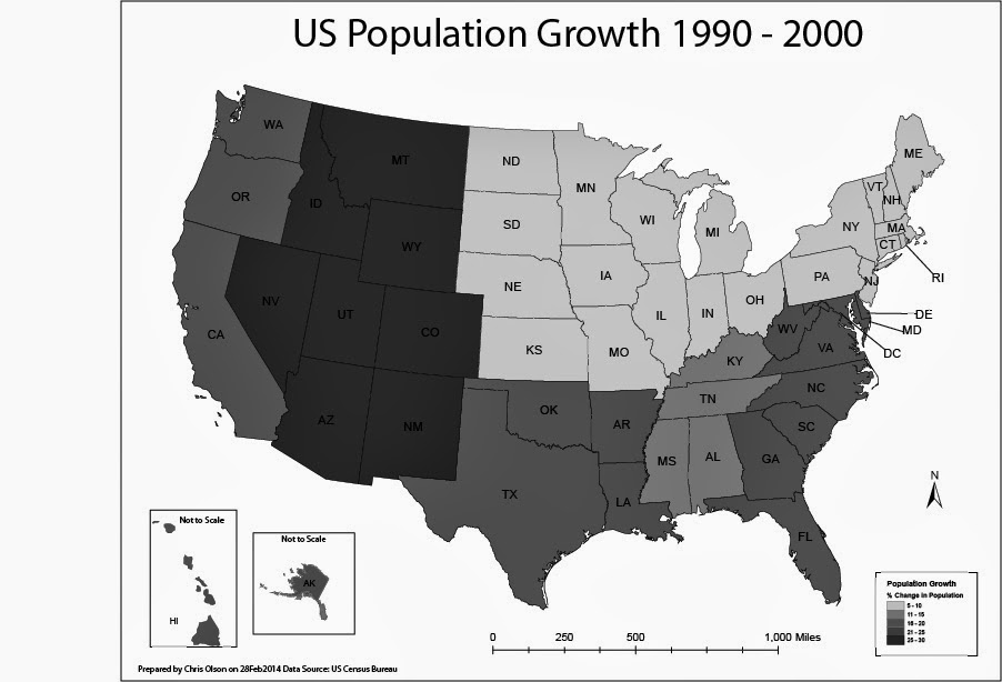
In this lab, I produced two choropleth maps showing population change in the United States of America. I used census data to illustrate the percent population change of each state for the period of April 1, 1990 to April 1, 2000. I used both ArcGIS and Adobe Illustrator to complete this assignment.
A choropleth map is a thematic map in which enumeration units are shaded with an intensity proportional to the data values associated with those units.
The first map displayed population change percentage at the State Level. I used the Natural break method for the first map to split of the data. For this map I selected a light to dark khaki color ramp to show the change.
The second map will display population change at the level of U.S. Census Divisions.
On the second map I manually created the breaks into even divisions.
Friday, February 21, 2014
Data Classification Module 6
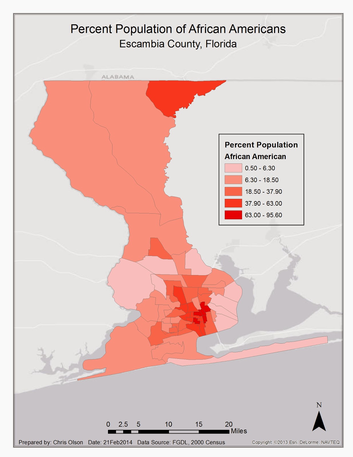
In this lab I explored the different ways that data can be displayed within ArcGIS. I displayed Equal Interval, Quantile, Standard Deviation, and Natural Break. This map displays the natural break. I choose this because it most accurately depicts the population of Escambia county.
Thursday, February 20, 2014
Projections Part 2/Data Search Module 6

Subscribe to:
Posts (Atom)