
Thursday, January 30, 2014
Cartographic Design
GIS Cartography Module 3
“GIS is not just about making maps”
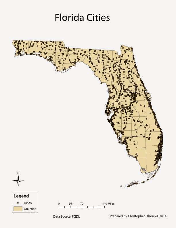
This lab focused on the cartographic output of GIS. GIS analyst needs to be able to create maps that convey information in a clear and concise manner. If the analyst is not able to do this through cartographic output their customer will not understand the research that they have conducted.

The first map for this lab involved more than one layer and how to manipulate and organize the layers in an intuitive manner. I downloaded an Adobe swatch exchange file from colorbrewer to have sequential colors that ramp upward in intensity to show increasing population in each state.

In the second map I added road, rivers, and urban areas over 1 million. I then excluded smaller roads and rivers since the map was overly cluttered. Finally I added a inset map and labeled the large urban areas.

The finally map for this week was a elevation map. This map shows an increasing intensity of colors for the higher elevations.
Friday, January 24, 2014
Introduction to Adobe Illustrator Module 2
Wednesday, January 22, 2014
Own Your Map! Module 2

Friday, January 17, 2014
Map Critique Module 1
Bad Map Design

This is a bad map for many reasons. The main problem is
there is entirely too much information. What is being displayed here could easily
be broken up into several maps. The author of this map may have interesting and
good data but one cannot understand what is being portrayed without spending a
good a lot of time reading each legend at carefully studying the map. The
author put in the time to gather data and make the map, but what you take out
is confusion of over lapping data on a very large scale.
Good Map Design

This is an example of a good map. This map shows clear and
detailed ancestry information through simple colors, which are pleasing to the
eye. It uses simple, neutral colors, which work well with this type of data.
The contrasts of neighboring colors make smaller details stand out. The labels
used are simple and clear information. This map follows all of Tufteisms from The visual Display of Quantitative
information. Although this map does not have a North arrow it is assumed
that North is up as the target audience will be some one from the United
States. Also the map would not be used for navigation purposes, as it does not
have navigable features.
Thursday, January 16, 2014
ArcGIS Overview Module 1

Tuesday, January 7, 2014
Introduction
Hello, I started out in the military working as an Imagery
Analyst where I was stationed at Offutt AFB in Omaha NE. I completed my
enlistment there and moved to Huntsville Al. While in Alabama I worked for
Intergraph creating 3D shape files using their software, which they said was
number two on the market to ARC. No one that I have talked to has ever heard of
it either. After two years in Huntsville I moved to Gulf Breeze Fl where I have
worked at Hurlburt Field for the last 7 years as an Imagery Analyst. I have
done some GIS work while in Florida but not as much as Alabama. I have just
completed by BAS in Technology and Resource Management. I hope the GIS track is
more enjoyable than getting a degree so that I could check a box off on applications.
Subscribe to:
Comments (Atom)