In this exercise, I comprehensively mapped one county in Florida. I acquired and format data, then create one or several maps to display those data. To bring all these feature into map projects, I explored both the LABINS,USGS,and FGDL web sites. These sites contained all the data files I needed to complete this project.
Thursday, March 6, 2014
Friday, February 28, 2014
Choropleth Mapping Module 7
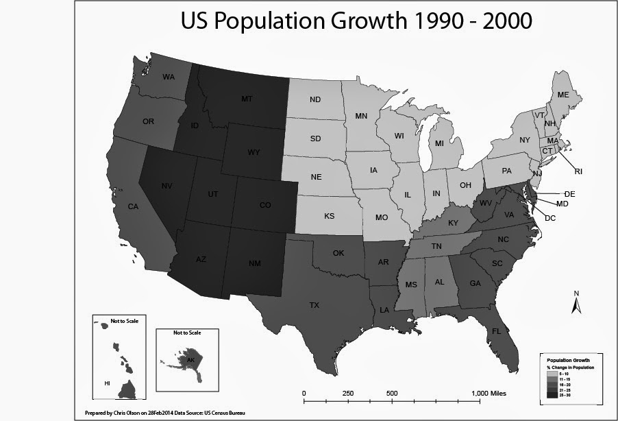
In this lab, I produced two choropleth maps showing population change in the United States of America. I used census data to illustrate the percent population change of each state for the period of April 1, 1990 to April 1, 2000. I used both ArcGIS and Adobe Illustrator to complete this assignment.
A choropleth map is a thematic map in which enumeration units are shaded with an intensity proportional to the data values associated with those units.
The first map displayed population change percentage at the State Level. I used the Natural break method for the first map to split of the data. For this map I selected a light to dark khaki color ramp to show the change.
The second map will display population change at the level of U.S. Census Divisions.
On the second map I manually created the breaks into even divisions.
Friday, February 21, 2014
Thursday, February 20, 2014
Projections Part 2/Data Search Module 6
Friday, February 14, 2014
Thursday, February 13, 2014
Projections Part I Module 5
In this lab we loaded three different coordinate systems into ArcGIS to compare the differences between them. As you can see in the legend the square miles of each county is slightly different in each of the systems. This lab is a good example why it is important to watch which system that you are using.
Friday, February 7, 2014
Subscribe to:
Posts (Atom)